Your YouTube thumbnail text can make or break your video’s success. The right font grabs attention, improves readability, and boosts click-through rates (CTR). Most channels see CTRs between 2% and 10%, with 4-5% being average. A higher CTR means more visibility, as YouTube recommends videos with strong engagement.
To maximize your thumbnails’ impact:
- Use bold, legible fonts like Impact or Bebas Neue for clarity on mobile screens.
- Ensure high contrast between text and background.
- Stick to 1-2 fonts to avoid clutter.
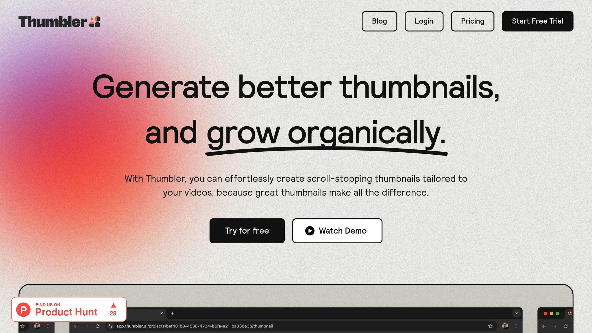
- Test designs using tools like Thumbler AI to find what works best.
Top font picks include Impact for bold headlines, Montserrat for lifestyle content, and Anton for high-energy topics like fitness or gaming. Pair these with thoughtful placement and styling to create thumbnails that stand out.
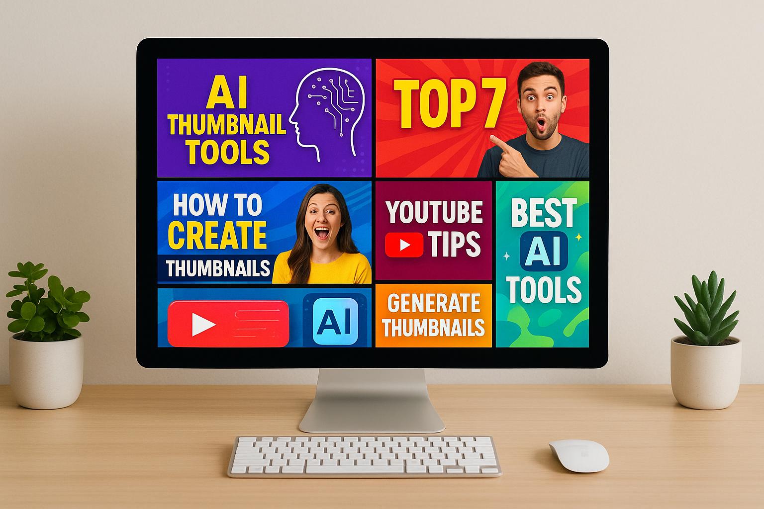
Best Fonts for HIGH CTR Thumbnails used by Popular Creators
What Makes a Good Thumbnail Font
The right font can make or break your YouTube thumbnail. It needs to grab attention, deliver your message clearly, and look great at any size.
Bold and Easy to Read
When it comes to YouTube thumbnails, bold fonts with thick strokes are a must. Since thumbnails often appear small - especially on mobile devices - thin or overly intricate fonts can become unreadable. Fonts like Bebas Neue and Impact are popular among creators because their bold, sans-serif styles stay clear even when scaled down. Their sturdy letterforms ensure your text remains sharp and legible.
Other reliable options include Verdana and Georgia. These fonts were designed with screen readability in mind. Verdana's wide spacing and open shapes make it crystal clear at smaller sizes, while Georgia’s serif design ensures readability without sacrificing style.
Beyond just picking the right font, pairing it with the right colors and contrast can make your thumbnails pop.
Contrast and Design Rules
Strong contrast between your text and background is essential. It’s not just about using light text on dark backgrounds (or vice versa); you also need to consider how your design looks across different screens and lighting conditions. Adding outlines, drop shadows, or borders can help your text stand out even more. Fonts like Badaboom BB and Caribold work particularly well with these enhancements.
Keeping your design simple is equally important. Stick to one or two fonts per thumbnail to avoid overwhelming viewers. Simplicity helps your message come across quickly - important since viewers spend only about 1.5 seconds deciding whether to click on a video based on its thumbnail. Always test your designs at YouTube’s display size to ensure they’re effective.
These strategies don’t just make your thumbnails look good; they also help create a consistent and recognizable brand, which is key to building trust with your audience.
Keeping Your Brand Consistent
Your font choices should reflect your channel's personality and the type of content you create. For example, a tech-focused channel might use modern, clean fonts like Montserrat or Rubik, while an entertainment channel could lean toward playful options like Pacifico. Whatever you choose, consistency is critical. Using the same fonts across thumbnails, banners, and other graphics makes your content instantly recognizable and reinforces your brand identity.
Decorative or script fonts can add flair, but use them sparingly. These types of fonts are best reserved for accents and should never overshadow the main message. Remember, clarity always comes first - your audience won’t click on what they can’t read.
With 90% of top-performing YouTube videos featuring custom thumbnails, every design choice matters, and your typography plays a big role in making your content stand out.
Best Fonts for YouTube Thumbnails
When it comes to YouTube thumbnails, the right font can make a huge difference in grabbing attention and increasing click-through rates (CTR). Let’s dive into some top font choices that can help your content stand out.
Top Font Recommendations
- Impact: This bold, sans-serif font is a classic for a reason. Its thick strokes make it perfect for attention-grabbing headlines, even at smaller sizes.
- Bebas Neue: Known for its clean and professional look, this sans-serif font is ideal for instructional videos or any content where highlighting text is important.
- Roboto: A versatile and highly readable sans-serif font, Roboto is great for subtitles and on-screen text, offering excellent clarity across different devices.
- Montserrat: With its elegant and legible design, Montserrat is a favorite for lifestyle, travel, fashion, and beauty channels.
- Anton: If your content is high-energy - like fitness, sports, gaming, or motivational videos - Anton’s bold style delivers the punch you need.
- Lato: This font provides a polished, professional vibe, making it a reliable choice for business-oriented or educational videos.
- Bangers: Looking for something playful? Bangers brings a fun, adventurous feel that works well for lighthearted or quirky content.
Font Comparison Chart
| Font Name | Style | Best Use | License |
|---|---|---|---|
| Impact | Bold, Sans-serif | General use, attention-grabbing | Free |
| Bebas Neue | Sans-serif | Instructional videos, highlighting text | Free |
| Roboto | Sans-serif | Subtitles, general use | Free |
| Montserrat | Sans-serif | Lifestyle, travel, fashion, beauty | Free |
| Anton | Sans-serif | Fitness, sports, gaming, motivational | Free |
| Lato | Sans-serif | Professional/business-related videos | Free |
| Bangers | Comic Sans | Fun, adventurous content | Free |
All of these fonts are free, making them accessible for creators at any budget level. You can find most of them on sites like dafont.com, but always double-check the licensing terms. Some fonts that are free for personal use may require a commercial license if your content is monetized.
sbb-itb-de62d42
How to Use Fonts in Your Thumbnails
Once you’ve got the basics of fonts and design down, the next step is applying them effectively. Picking the right font is important, but how you style and place it can make all the difference in how your thumbnail grabs attention.
Combining Fonts and Styling
A good rule of thumb? Use a bold font for your headline and a simpler font for subtext. For instance, pairing something strong like Impact or Bebas with a clean sans-serif font like Roboto or Montserrat creates a clear hierarchy and keeps things easy to read.
Stick to a maximum of two fonts per thumbnail. Adding more than that can make your design look messy and distract from your message. Make sure the fonts you choose work well together in both style and weight to maintain a polished look.
Color and outlines can also boost font visibility. High-contrast colors between your text and background are a must, especially if your thumbnail has a lot going on visually. Bold outlines and drop shadows can help your text stand out, even when viewed at smaller sizes. For example, creators like Wengie use bright colors and thick outlines to draw attention to their text.
Adding shadows doesn’t just make your text pop - it also creates depth, helping it stand out against busy backgrounds. This is particularly helpful when your thumbnail has multiple elements competing for attention.
Once you’ve nailed the font style, it’s time to think about where and how to place your text.
Text Placement and Size Tips
Position your main text in clear areas of the thumbnail, such as the center or upper third. Avoid placing it in the bottom-right corner, as it might overlap with YouTube’s video duration display.
Text size is another crucial factor, especially for mobile viewers. Make sure your text is large enough to be legible on smaller screens. A good trick is to preview your thumbnail at 10% of its original size - if you can still read it, you’re good to go. With most YouTube views coming from mobile devices, this step is non-negotiable.
Spacing is just as important as size. Leave enough room around your text so it doesn’t feel cramped or blend into other elements.
Keep your text short and to the point - ideally between 3 to 5 words. Viewers decide what to click in a split second, so your message needs to be quick and clear.
Testing Fonts with Thumbler AI

Once you’ve finalized your thumbnail design, test its performance with tools like Thumbler AI. This platform allows you to run A/B tests, comparing different font styles and combinations to see what resonates most with your audience. Instead of guessing, you’ll get real data on metrics like click-through rate (CTR) and viewer engagement.
Pay attention to metrics like CTR, view duration, and the impressions-to-click ratio. If you see a spike in CTR after tweaking your fonts, it’s a clear sign you’re on the right track. This kind of data offers more reliable insights than personal opinions or assumptions.
Thumbler AI also helps you identify trends. For example, you might learn that your audience prefers clean, professional fonts over playful ones, or that certain color combinations get more clicks. This approach ensures your design choices are backed by performance data, not just guesswork.
While experimenting, don’t lose sight of your brand identity. Stick to a set of brand guidelines that define your primary and secondary fonts, color schemes, and styling rules. Even as you test new designs, make sure they align with your channel’s overall look and feel.
To avoid common pitfalls, steer clear of overly decorative or thin fonts that become unreadable at smaller sizes. Avoid placing text on busy backgrounds without ensuring enough contrast, and resist the urge to use too many fonts or colors. Keeping your fonts bold, simple, and high-contrast will deliver the best results.
Conclusion
Picking the right thumbnail font can make a big difference in your channel's click-through rate (CTR) and overall growth. Fonts like Montserrat, Verdana, and Badaboom BB are popular choices because they stay sharp and readable, even when scaled down.
Here’s what matters most: focus on readability over decorative flair, ensure high contrast between text and background, and stick to consistent font choices to strengthen your brand's identity. These simple yet effective practices align with the strategies we’ve explored for creating standout thumbnails.
Successful content creators show how font choices can align with their content’s tone - whether it’s fun, professional, or educational - to draw in more viewers and boost engagement.
To take it a step further, Thumbler AI can help you test and optimize your font choices by providing data-driven insights. Use A/B testing to see which fonts resonate most with your audience and make decisions based on real viewer behavior.
FAQs
What’s the best way to make sure my YouTube thumbnail text is easy to read on any device?
To make sure your YouTube thumbnail text is easy to read on both desktop and mobile devices, stick to bold, straightforward fonts that contrast sharply with the background. Steer clear of overly decorative or thin fonts - they can be tough to read, especially on smaller screens.
Keep your text short and punchy by focusing on key words or phrases. Aim for a minimum text size of 48 pixels for main titles to maintain clarity. It's also a good idea to test your thumbnails on various screen sizes to ensure they remain readable and visually appealing. This approach helps your design grab attention and stay effective across all devices.
How can I test and optimize my thumbnail fonts to boost click-through rates?
To get the most out of your YouTube thumbnail fonts, start by A/B testing different styles, sizes, and colors. This lets you see what resonates most with your audience. Try out a few variations and keep an eye on the results to figure out what grabs attention and drives clicks.
Make sure your fonts are clear, bold, and high-contrast so they’re easy to read - even on smaller screens like smartphones. Dive into your YouTube analytics regularly to monitor how your thumbnails are performing and tweak your font choices based on what’s working. Sometimes, even simple changes - like bumping up the font size or switching to a cleaner typeface - can have a noticeable impact on your click-through rates.
How can I use fonts in my YouTube thumbnails to create a consistent brand identity?
To create a strong and recognizable brand identity on your YouTube channel, use the same font style across all your thumbnails. This simple step gives your channel a unified look that viewers can easily connect with your content. Combine this with a consistent color scheme and layout to further reinforce your visual branding.
Keeping your thumbnail design consistent doesn’t just make your channel appear more polished - it also helps viewers recognize and remember your brand. Over time, this builds trust and encourages more engagement, making it easier for your audience to spot your videos instantly.