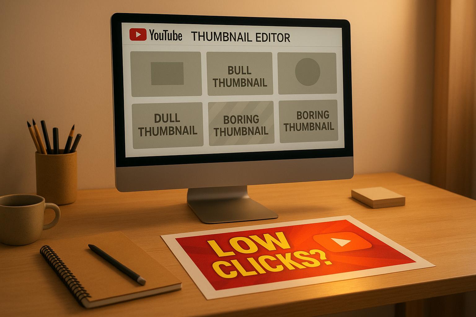
Your YouTube thumbnails might not be getting the clicks you want because they’re not grabbing attention, connecting emotionally, or matching your video’s content. Thumbnails are the first thing viewers see, and they play a huge role in whether someone clicks or scrolls past. Here’s what could be going wrong:
- Poor design: Cluttered visuals, hard-to-read text, or too many elements can confuse viewers, especially on mobile screens.
- Lack of emotion: Thumbnails without faces or emotional expressions miss out on creating a connection with viewers.
- Misleading visuals: Thumbnails that don’t match the video’s content can hurt trust and confuse YouTube’s algorithm.
Fixing these issues can boost your click-through rate (CTR) by 3–6%, leading to more views and better performance. Use bold visuals, clear text, and emotional appeal to create thumbnails that stand out and align with your video’s message.
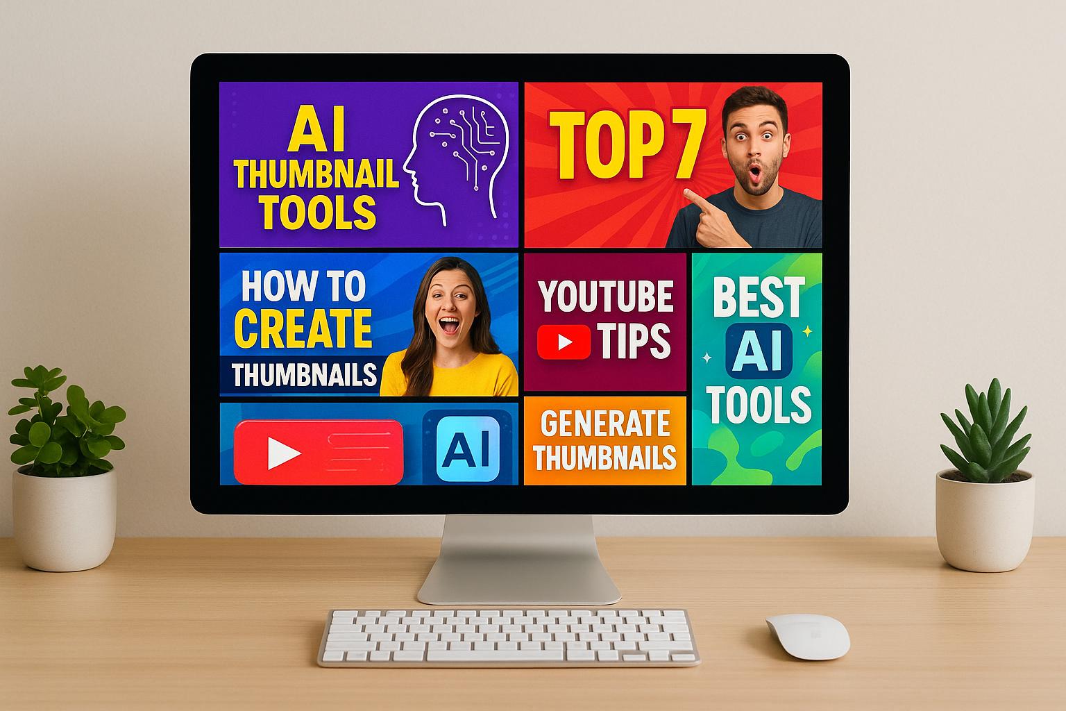
5 YouTube Thumbnail Rules That Doubled My Click Rate
Why Your YouTube Thumbnails Get Few Clicks
Your thumbnails might not be pulling in the clicks you’re hoping for, and there are a few key reasons why. Pinpointing these issues can help you figure out what’s stopping your videos from standing out.
Bad Design Decisions
A poorly designed thumbnail can turn viewers away faster than you think. Since over 70% of YouTube watch time happens on mobile devices, your thumbnail needs to look sharp and clear - even on a tiny screen. If it’s cluttered or hard to understand at a glance, viewers will scroll right past it.
One common mistake? Overloading thumbnails with too many elements. Using excessive colors, fonts, or graphics can overwhelm viewers. Lesley Vos from Mention.com noted in January 2025 that thumbnails stuffed with multiple fonts, clashing colors, and high contrast "exhausts visitors and leads them to ignore such videos".
Another design flaw is the lack of a clear focal point. When every element in your thumbnail is vying for attention, the overall impact gets diluted. Add to that illegible fonts - especially decorative ones - and your thumbnail becomes even harder to read on smaller screens. This is a big problem since mobile users dominate YouTube’s audience.
Missing Emotional Appeal
Good design isn’t enough; your thumbnails also need to spark an emotional connection. Thumbnails featuring close-up facial expressions generate about 75% more clicks than those without. Why? Because people are naturally drawn to faces. If your thumbnail doesn’t include this element, you’re missing a powerful chance to engage viewers.
Faces can instantly convey emotion and set the tone of your video. A surprised look, a confident smile, or an intense gaze can tell viewers what to expect before they even read the title. Without this emotional hook, your thumbnail risks blending into the sea of static images competing for attention.
A strong focal point is just as important. If your thumbnail doesn’t clearly direct the viewer’s eye or communicate a specific emotion, it can come across as bland or uninteresting. And when viewers can’t quickly grasp whether your video will be fun, informative, or entertaining, they’re more likely to click on something else that provides a clearer message.
Thumbnail Doesn't Match Video Content
Even if your thumbnail looks great and connects emotionally, it won’t perform well if it doesn’t align with your video’s content. Misleading thumbnails not only damage viewer trust but also confuse YouTube’s algorithm. Jonathan English emphasizes the importance of delivering on your thumbnail’s promise. In fact, thumbnails can influence click-through rates (CTR) by as much as 30% or more, but only if they accurately represent the video.
When there’s a disconnect between what the thumbnail promises and what the video delivers, key metrics like watch time and engagement take a hit. Dr. William Sen, CEO of Blue Media, explains that “if your video is engaging, once viewers click on a thumbnail and start watching, they tend to view the video similarly to how others do, regardless of the thumbnail that initially attracted them”.
The damage doesn’t stop there. Repeatedly misleading viewers can harm your channel’s reputation. If people feel let down by your thumbnails, they’ll start associating your content with disappointment, making them less likely to click on your future videos.
This mismatch also confuses YouTube’s recommendation system. The platform relies on accurate thumbnails to suggest videos to the right audience. When your thumbnail doesn’t match your content, it becomes harder for the algorithm to figure out who should see your videos, ultimately shrinking your reach.
What Makes YouTube Thumbnails Work
Thumbnails are more than just a visual element - they're a powerful tool to grab attention and drive clicks. In fact, 90% of the top-performing videos on YouTube use custom thumbnails.
Clear and Easy to Read
A great thumbnail should communicate its message instantly. With over 60% of YouTube views coming from mobile devices, designing for small screens is crucial.
Bright, contrasting colors can make your thumbnail pop against YouTube’s white background. For example, Cocomelon uses bold primary colors and familiar character images, making their thumbnails instantly recognizable. Similarly, Adriene Mishler keeps it simple with yoga poses, clean color schemes, and bold white text, ensuring her thumbnails remain readable even on smaller screens.
Text is another key component. It needs to be large, concise, and easy to read. Aim for 3-6 words and make sure the text contrasts sharply with the background. Creators like Claire Saffitz use a mix of text and cutout images to encapsulate their video content perfectly. Meanwhile, Karen Puzzles pairs her image with text that teases the complexity of the puzzle, drawing viewers in. These examples show how combining clear visuals with readable text can make thumbnails effective across devices.
Once your design is clear, the next step is ensuring technical accuracy.
Correct Size and Image Quality
YouTube has specific recommendations for thumbnail dimensions to ensure they display properly across platforms:
| Element | Recommendation |
|---|---|
| Size | 1280 x 720 pixels |
| Aspect Ratio | 16:9 |
| File Size | Under 2 MB |
| File Format | JPG, PNG, GIF, or BMP |
High-quality images are non-negotiable. Low-resolution thumbnails or improper sizing can make your visuals appear pixelated, stretched, or distorted. Creators like Jamie Oliver use sharp, high-resolution images with clean, uncluttered backgrounds to make their food look irresistible on any device. This attention to image quality ensures thumbnails appear polished and professional, whether on a desktop or mobile screen.
Once your thumbnail looks great and meets technical standards, it also needs to align with your video’s content.
Matches Your Video Content
Thumbnails that misrepresent your video can harm your credibility. Authenticity is key to building trust and encouraging longer watch times.
"Always deliver what you promise in your thumbnail, title, and metadata." - Jonathan English, CEO for Venture Videos
When thumbnails accurately reflect the content, they set clear expectations and build viewer loyalty. For instance, Lone Fox uses before-and-after visuals of home decor projects, complete with associated costs, to give viewers a clear idea of what to expect. This approach not only signals relevance but also ensures the audience feels their time is well-spent.
"Good marketing is telling the truth invitingly." - Austin Mock
Delivering on what your thumbnail promises increases watch time and strengthens trust. Satisfied viewers are more likely to return for future videos, knowing they can rely on your thumbnails to represent your content accurately.
Consistency is another important factor. For example, Chanel uses black-and-white imagery with consistent fonts and layout in their thumbnails, while Shopify maintains clear branding across all their visuals. A consistent style helps viewers instantly recognize your content in their feed, fostering familiarity and boosting clicks.
sbb-itb-de62d42
Tools and Methods to Fix Your Thumbnails
Creating effective thumbnails doesn’t have to feel like a guessing game. With the right tools, you can turn thumbnail design into a strategic and impactful process.
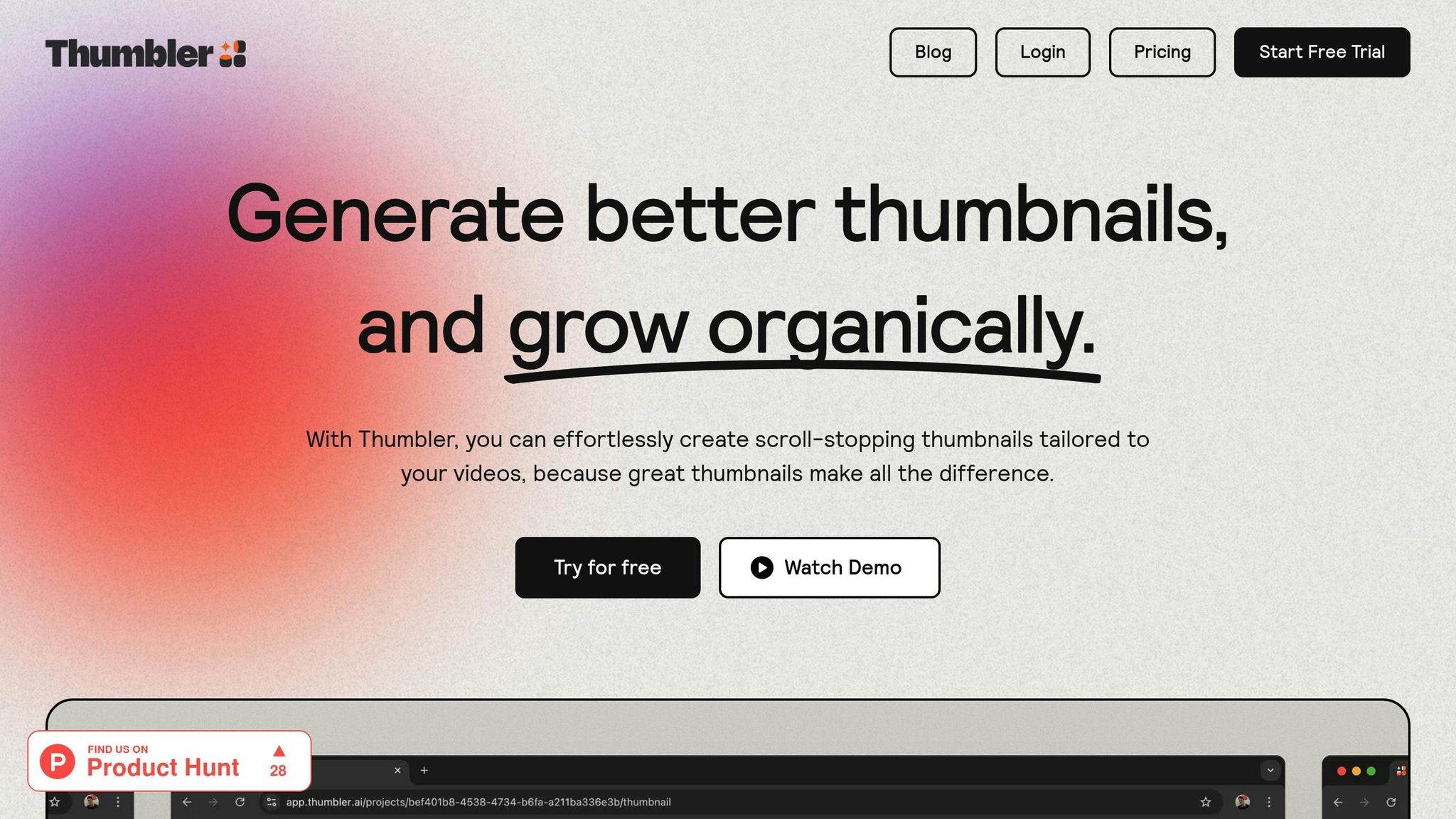
AI Tools Like Thumbler AI

AI-powered tools are changing the way thumbnails are designed. These tools analyze viewer behavior, trends, and demographics to create thumbnails that are not just visually appealing but also perform better. Studies reveal that AI-generated thumbnails can increase click-through rates by up to 30% and engagement by 25%.
Take MrBeast, for example. He uses AI tools to optimize his thumbnails across his massive content library. With over 100 million monthly views, some of his videos achieve click-through rates as high as 20%. Similarly, Marques Brownlee (MKBHD) relies on AI to streamline his thumbnail production while maintaining his signature style. By tailoring designs to his audience’s preferences, he ensures his thumbnails consistently resonate with viewers. In fact, 90% of YouTube creators report higher engagement after adopting AI thumbnail tools.
Thumbler AI stands out by addressing common challenges in thumbnail creation. It offers features like AI-generated thumbnails, a branded design library for consistent visuals, and tools to compare multiple designs before publishing. Unlimited revisions allow creators to experiment freely, and a soon-to-be-released face swap feature promises to make testing different expressions even easier.
While AI tools simplify the process, traditional design software offers unmatched creative flexibility.
Design Software Like Canva or Photoshop
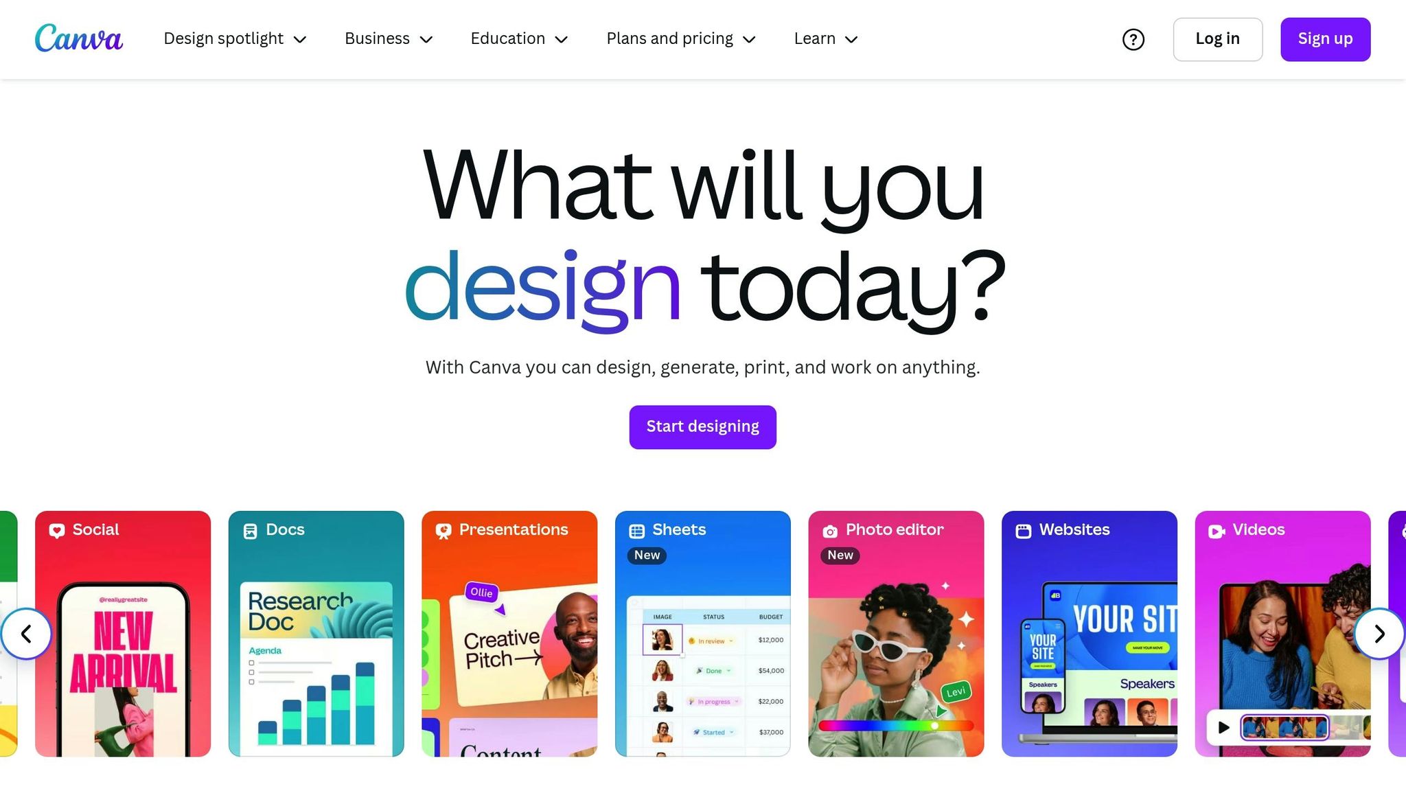
For those who prefer hands-on control, traditional design software is an excellent choice. Photoshop provides advanced tools for detailed image editing, color adjustments, and adding visual elements to make your thumbnails pop. Whether it’s crafting custom graphics or applying text effects, Photoshop gives you the freedom to create highly polished designs.
Canva, on the other hand, is known for its intuitive drag-and-drop interface. It includes a vast library of templates, photos, icons, and illustrations. Canva also incorporates AI tools like Magic Media, which can generate images from text in various art styles. Both platforms allow you to upload and edit your own images, ensuring your thumbnails meet YouTube’s recommended size of 1280 x 720 px.
When designing, simplicity is key. Use bold, contrasting colors to make text readable and ensure your thumbnail aligns with your content’s overall theme for a cohesive look.
Test and Improve Your Thumbnails
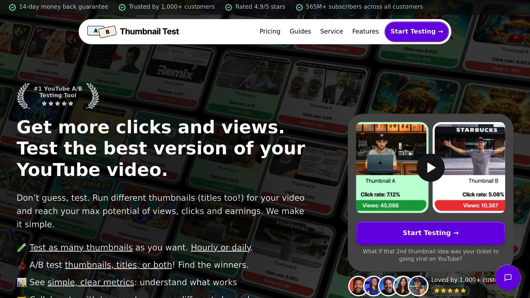
Even with great tools, refining your thumbnails requires ongoing testing and iteration. YouTube’s "test and compare" A/B testing feature is a game-changer, helping you identify which designs drive the most clicks.
Experiment with different variations - try altering colors, text, or imagery - and measure the results. Research shows that using AI-powered platforms can cut design time by up to 90%, freeing up more time to tweak and improve your thumbnails.
Keep an eye on analytics like click-through rates, watch time, and audience retention. If a thumbnail attracts clicks but viewers leave quickly, it might not align with your content. Conversely, if a thumbnail gets fewer clicks but retains viewers longer, consider adjusting its design to better reflect the video’s value.
Finally, review your top-performing videos to identify patterns in their thumbnails. Use these insights to inform your future designs. By combining the efficiency of AI with your creative instincts, you can craft thumbnails that not only grab attention but also reflect your brand’s unique identity.
These strategies and tools provide a solid foundation for improving your thumbnails and driving more engagement.
Simple Ways to Get More Thumbnail Clicks
Want to boost your thumbnail game? Try these practical tips to grab attention and get those clicks rolling in. Pair these strategies with your design tools for even better results.
Add Faces and Strong Emotions
Using faces in your thumbnails isn’t just a nice touch - it’s a game-changer. Thumbnails featuring faces can increase your click-through rate (CTR) by 20%. Add a layer of strong emotions like surprise, excitement, or curiosity, and that number jumps by another 25%. Why? Because emotions create a connection. When people see an expression of shock or joy, they naturally want to know what’s behind it.
"When viewers see expressions of surprise, excitement, or curiosity, it's as though they're peeking into the video's emotional landscape, creating intrigue and encouraging clicks." - YouGenie Blog
Authenticity matters here. Viewers can easily spot fake or over-the-top expressions, and that can hurt your credibility. Use close-up shots that capture real emotions, and make sure the person in your thumbnail is making direct eye contact. This small detail can create a stronger bond with potential viewers.
Take a page from MrBeast’s playbook, where facial expressions are a key part of his strategy:
"We must not rest until mouths are closed in everyone's thumbnails." - MrBeast
Tailor your approach to your audience. A tech channel might benefit from a look of curiosity or amazement, while a gaming channel could lean into excitement or surprise. Experiment with different expressions to see what resonates best with your viewers.
Use Empty Space Wisely
A cluttered thumbnail is a missed opportunity. Empty space, or negative space, helps your key elements stand out. It ensures your thumbnail doesn’t overwhelm viewers as they scroll. Think of it as giving your design room to breathe.
If you’re featuring a person, product, or standout visual, let it shine by keeping the surrounding area simple. Simplify your background and focus on balancing positive and negative space. This doesn’t mean your thumbnail should look empty - it means every element should have a clear purpose.
The best thumbnails use space thoughtfully. Text, images, and graphics should work together without feeling cramped. If your thumbnail feels too busy, it’s likely to be overlooked by viewers scrolling quickly through YouTube.
Track Performance and Make Changes
Guesswork won’t cut it - data is your best friend. Keep an eye on your CTR to understand how your thumbnails are performing. CTR measures how often people click your thumbnail after seeing it, and it’s a key indicator of success.
Here’s a quick breakdown of CTR benchmarks:
- 4-5%: Average performance
- 6-10%: Strong performance
- 10%+: Viral potential
Even a small bump in CTR - say, 3-6% - can lead to a noticeable increase in views over time. If your impressions are high but your CTR is low, it’s time to test a new thumbnail. Also, monitor your Average View Duration (AVD). Aim for viewers to watch at least 50% of your video. If they’re clicking but leaving quickly, your thumbnail might not match the video’s content.
Use A/B testing to refine your designs. YouTube offers built-in tools to compare different thumbnail versions, so you can see what works best. Don’t stop after one test - keep this process ongoing.
Look for patterns in your top-performing thumbnails. What emotions do they show? What colors and text placements work best? Use these insights to guide future designs. Remember, your personal preferences might not align with what your audience loves. Let the data lead the way, and be ready to adapt your strategy based on what you learn.
Conclusion: Better Thumbnails Mean More Views
Your thumbnail is the gateway to your video and plays a huge role in its success. Studies show that refining your thumbnail design can lead to a 30-40% boost in views without tweaking any other part of your video. A well-made thumbnail can also increase your click-through rate by 3-6%, directly impacting views and engagement.
Top-performing videos often share a key characteristic: 90% of them use custom thumbnails. This underscores the importance of combining good design, emotional resonance, content alignment, and proper sizing to create thumbnails that draw attention and encourage clicks. These strategies, as discussed earlier, are essential for driving performance.
YouTube’s algorithm values click-through rate as a ranking factor. This means that improving your thumbnails doesn’t just attract more clicks - it also enhances your video’s search visibility, helping you reach a broader audience. By using bold visuals, expressive faces, clear text, and consistent branding, you can build trust and recognition among viewers.
The most successful creators treat thumbnail optimization as an ongoing effort. For instance, one creator increased their click-through rate from 1.1% to 6%, while another jumped from 3.7% to 7%, resulting in a massive surge in views.
To make the most of these opportunities, tools like Thumbler AI can simplify the design process by delivering professional-quality thumbnails, allowing you to focus on producing great content. Whether you rely on AI, design software, or trial-and-error testing, the key is to keep refining your thumbnails based on performance insights.
As we've seen throughout, strong thumbnails are a cornerstone of driving views, engagement, and long-term channel growth.
FAQs
How can AI tools help improve the click-through rates of my YouTube thumbnails?
AI tools are a game-changer when it comes to creating YouTube thumbnails. They simplify the design process while ensuring the visuals resonate with your audience. By analyzing trends and viewer behavior, these tools can recommend attention-grabbing designs that fit your content and branding perfectly.
They also make tasks like picking high-quality images, testing out different templates, and even running A/B tests much easier. The result? Thumbnails that not only save you time but also look great and are optimized to drive more clicks.
What makes a YouTube thumbnail emotionally connect with viewers?
To make your YouTube thumbnail emotionally engaging, pay attention to a few essential details. Featuring human faces with clear, expressive emotions can immediately capture attention and create a sense of connection with viewers. Incorporating bold, vibrant colors helps evoke curiosity or excitement, setting the tone for your video. Also, spotlight dynamic scenes or captivating visuals that intrigue your audience. Just ensure the thumbnail matches your video's theme - this consistency helps build trust and keeps viewers engaged.
Why should your thumbnail accurately represent your video, and how does it influence viewer trust and engagement?
Creating a thumbnail that truly reflects your video’s content is key to earning viewer trust and driving engagement. When your thumbnail matches what the video delivers, viewers know exactly what to expect, making them more likely to click, stay, and enjoy the content. This alignment not only keeps viewers satisfied but also improves retention rates.
On the flip side, misleading thumbnails can backfire. They can damage your credibility and make viewers hesitant to watch your future videos. Sticking to thumbnails that deliver on their promise helps build a dependable brand image, encouraging viewers to keep coming back and interact with your content regularly.