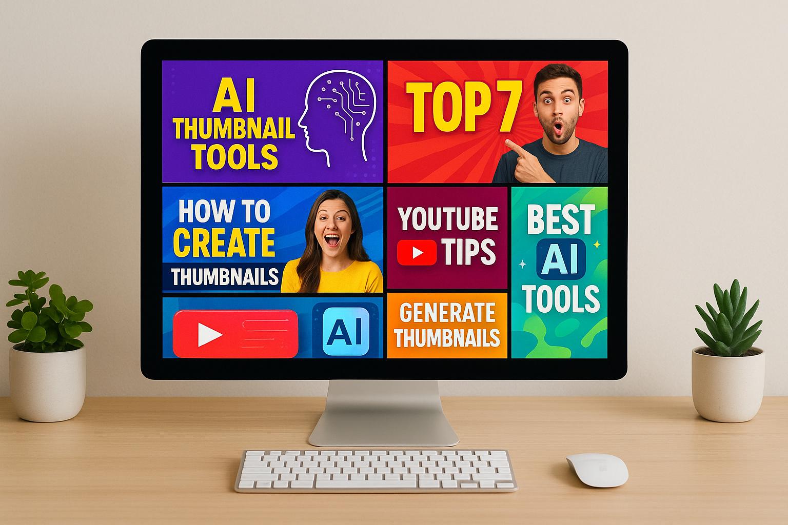
Your video thumbnail is the first impression your content makes. A well-matched, custom thumbnail can increase click-through rates by up to 30%, with 90% of top-performing YouTube videos using them. Here’s how to make thumbnails that align with your video themes and boost engagement:
- Understand Content Themes: Group videos into clear categories (tutorials, reviews, etc.) and analyze what resonates with your audience using click-through rates and analytics.
- Consistent Branding: Use the same fonts, colors (3-5 max), and layout across thumbnails to build recognition. Keep visuals clean and professional.
- Design for Mobile: Over 80% of YouTube viewers use mobile devices, so focus on close-up images and bold, readable text.
- Color and Emotion: Use colors that match your video’s tone (e.g., red for energy, blue for trust) and include expressive faces to connect with viewers.
- Thumbnail Types: Choose between video stills (quick), enhanced frames (balanced), or custom designs (high impact) based on your resources and goals.
- AI Tools: Platforms like Thumbler AI can speed up thumbnail creation and testing, improving CTR by up to 30%.
To maximize results, test different designs (A/B testing) and track metrics like CTR and watch time. Regularly update your approach to stay aligned with viewer preferences and design trends.
YouTube Thumbnail Design - 50% More Views With This Strategy!
Video Content Themes and Brand Identity Basics
Before diving into thumbnail design, it’s crucial to understand your content and brand identity. This groundwork ensures your thumbnails aren’t just random visuals but part of a consistent strategy that enhances recognition and builds trust. Let’s explore how to align your thumbnails with your themes and brand.
Identifying Your Video Content Themes
Your content themes are the backbone of your channel. They represent the topics and styles that define your videos. Start by reviewing your library and grouping your content into clear categories - such as tutorials, comedy skits, or gameplay. Look for patterns that consistently grab your audience’s attention.
Dive into your analytics to uncover what works best. For example, check click-through rates to identify which thumbnails drive the most engagement. If your beginner tutorials outperform advanced ones, that’s a clue to focus on simpler, more accessible topics in your designs.
It’s also helpful to research your niche. Analyze what’s popular in your field. For instance, tech channels often opt for sleek, minimalist designs, while cooking channels favor warm, appetizing imagery. Use these insights to shape your thumbnails while staying true to your unique style.
Once you’ve defined your themes, unify them under a consistent visual identity that reflects your brand.
Creating Consistent Brand Identity
Consistency is key when it comes to building recognition. When viewers can immediately spot your content in a crowded feed, you’re fostering familiarity and trust.
Stick to one or two fonts and a fixed color palette of three to five colors. This creates a cohesive look across all your thumbnails. Templates can also help by keeping text and images aligned in similar positions, giving your designs a polished, professional feel.
High-quality images are non-negotiable. Make sure they reflect your brand’s tone. For example, a business channel might use clean, professional visuals, while a lifestyle vlog could lean into vibrant, playful imagery.
Consistency doesn’t mean every thumbnail looks identical. Instead, aim for a unified style where all your thumbnails feel like they belong to the same family.
Designing for U.S. Audiences
When targeting U.S. viewers, bold visuals and clear messaging are essential. Use high-contrast colors and easy-to-read fonts to ensure your thumbnails grab attention instantly. Focus on benefit-driven text that highlights what viewers will gain - specific, direct messaging works far better than abstract or vague descriptions.
Emotions also play a big role. Thumbnails featuring expressive faces - whether showing surprise, excitement, or concern - can create an immediate connection, encouraging clicks.
Be mindful of cultural context when choosing colors and imagery. Red, white, and blue can evoke patriotism, while green often suggests success or wealth. Purple, on the other hand, might hint at luxury or creativity. These subtle cues can make a big difference in how your thumbnails resonate.
Finally, remember that U.S. audiences often decide what to watch in seconds. Your thumbnails should communicate their message clearly and quickly. Avoid clutter and focus on one strong, compelling idea per design.
How to Design Thumbnails That Match Content Themes
Creating thumbnails that reflect your content themes while grabbing attention is a critical part of building a strong visual identity for your videos. Here's how you can design thumbnails that align with your content and resonate with viewers.
Selecting Images and Graphics That Match Themes
Start by choosing a keyframe or image that clearly represents your video's theme. For example, in a cooking tutorial, you might highlight the finished dish or a dramatic cooking moment. Tech reviews? Showcase the product front and center, ensuring its details are easy to see.
Since over 80% of YouTube viewers watch on mobile devices, close-up shots are often the best choice. Large headshots or zoomed-in product images tend to perform better than full-body pictures. This approach ensures viewers can quickly grasp details, even on smaller screens.
Keep your background simple to avoid distractions. A clutter-free background helps emphasize your main subject and makes text overlays easier to read. Speaking of text, limit overlays to just a few words and pick clear, bold fonts. This keeps your thumbnail informative without overwhelming viewers or spoiling too much.
Including faces with strong emotions can also boost engagement. For instance, kid vloggers Vlad and Nikita frequently use expressions like excitement or surprise in their thumbnails, which helps draw viewers in.
Using Color Theory and Emotional Elements
Once you've nailed the image, use color and emotion to reinforce your message. Colors are powerful - they set the tone and help viewers understand what to expect from your video. Research shows that visuals stick in memory far better than text, making your color choices even more important.
Pick a primary color that complements your content's mood. For instance:
- Red and orange: Great for high-energy, action-packed videos like gaming or sports.
- Blue and green: Perfect for instructional or informational content that aims to build trust.
- Yellow and purple: Ideal for creative or inspiring themes, suggesting energy and originality.
To make your thumbnail pop, use complementary colors. For example, pair a blue background with orange text for better contrast and readability. Warm colors (like red and orange) tend to evoke excitement, while cool colors (like blue and green) create a sense of calm. Entertainment and gaming channels often thrive with warm tones, whereas tutorials or educational content might benefit from cooler hues.
"The emotional undercurrent of color has nothing to do with cinema and everything to do with our own natural psychology." – Noam Kroll, Filmmaker
Take a cue from Yoga with Adriene, who uses light tones and white banners in her thumbnails to create a calming, consistent aesthetic. This approach not only highlights her text but also reinforces the peaceful vibe her audience expects.
Experiment with different color combinations using A/B testing to identify what resonates with your audience. What works for one channel might not work for another, so let your analytics guide you.
Picking the Right Thumbnail Type
Choosing the right type of thumbnail depends on your content style, posting schedule, and branding goals. Here are three main options:
| Thumbnail Type | Time Required | Brand Consistency | Engagement | Best For |
|---|---|---|---|---|
| Video Stills | Minimal | Moderate | Low to Moderate | Quick uploads or behind-the-scenes content |
| Enhanced Frames | Moderate | High | Moderate to High | Regular uploads with a consistent schedule |
| Custom Designs | Extensive | Very High | High | Premium content or competitive niches |
- Video Stills: Ideal for quick-turnaround content, these are simple frames pulled from your footage. Choose moments with clear expressions or striking visuals, and add basic text or adjust brightness to make them stand out.
- Enhanced Frames: Start with a still and improve it by adding professional text, graphics, or subtle color edits. This strikes a balance between efficiency and polish, maintaining authenticity while boosting appeal.
- Custom Designs: These combine multiple images or graphics for maximum impact. They're perfect for competitive niches or major launches where standing out is key.
For example, in 2023, Claudia Ayuso grew her YouTube channel to over 24,000 subscribers with just 30 videos. Her secret? Consistently using high-quality, personalized thumbnails featuring herself with white text overlays. This approach not only made her channel visually cohesive but also helped her connect with viewers.
When deciding on your thumbnail approach, consider your posting frequency and available resources. Consistency is more important than perfection, so choose a method you can stick to over time.
The ultimate goal is to create thumbnails that represent your content accurately while encouraging clicks. Focus on clarity, emotional appeal, and alignment with your video's theme rather than just aiming for flashy designs.
Customizing Thumbnails for Different Content Types
Designing thumbnails that fit various video types while staying true to your brand identity requires a mix of consistency and adaptability. The key is ensuring viewers can quickly recognize your content and understand the type of video they're about to see.
Building a Signature Thumbnail Style
Once you've nailed the idea of aligning thumbnails with video themes, the next step is creating a distinct visual style. Think of this as your channel's "fingerprint." Start by defining a few core elements that will appear in every thumbnail - things like your color scheme, font choices, and layout structure.
Take MrBeast, for instance. His thumbnails are instantly recognizable thanks to their consistent use of colors and layouts.
Develop a template that locks in key elements like where the main image goes, how text overlays are placed, and any recurring design motifs.
Pick two or three primary colors that represent your brand and stick to them across all thumbnails. These colors should contrast well for readability. For example, you might use a bright blue as your base color, white for text, and orange for accents.
For fonts, establish a hierarchy: one bold, clear font for headlines and another for secondary text. Since most viewers will see thumbnails on mobile devices, prioritize readability at smaller sizes. Your font choices should reflect your brand's vibe - whether playful, professional, or somewhere in between.
Now, to make your content stand out, add visual cues specific to each type of video.
Using Visual Elements to Separate Content Types
While your signature style ties everything together, you can use unique visual cues to distinguish between content categories. This approach keeps your channel organized while staying true to your brand.
One effective strategy is color-coding. Assign specific accent colors to different types of videos - green for tutorials, red for reviews, and so on. Your primary brand colors remain the same, but these accents make it clear what kind of content viewers can expect.
You can also vary layouts. For example, tutorials might use split-screen designs, while reviews could feature product-focused visuals. Gaming videos could include dynamic, action-packed shots, while educational content might lean on clean, centered compositions.
To take it a step further, consider adding small icons or badges for each content series. Placing these consistently in the same spot on every thumbnail makes it easy for viewers to identify the type of video at a glance while reinforcing your channel's identity.
With these distinctions in place, it's time to balance creativity with brand consistency.
Maintaining Brand Consistency While Allowing Creativity
Your brand elements - like color palette, fonts, and logo placement - serve as the foundation for your thumbnails. But within that framework, leave room for creative tweaks that suit each content type. This balance ensures your thumbnails are both cohesive and engaging.
For instance, set specific guidelines for different types of videos: close-up, warm imagery for cooking content, and minimalist, cool tones for tech reviews. Even with these variations, both styles can fit under your brand's overall look.
Experiment within your guidelines to see what works best. You might discover that certain color combinations or layouts drive more clicks for specific types of videos.
Include recurring design elements that adapt to different content. This could be a unique graphic, a consistent way of framing faces, or a signature lighting style that appears across all thumbnails.
Keep a clear visual hierarchy in every thumbnail. Make sure the most important element - whether it's a face, a product, or key text - stands out. This helps viewers quickly grasp the content even when scrolling through a crowded feed.
Lastly, use expressive faces to boost engagement. Whether your video is educational or purely entertaining, genuine emotional expressions make your thumbnails more compelling and clickable.
The goal is to create a system that’s both flexible and cohesive. Your audience should immediately recognize your videos and know what they're about, no matter the content type.
sbb-itb-de62d42
Using AI Tools to Speed Up Thumbnail Creation
Creating cohesive, eye-catching thumbnails doesn’t have to eat up hours of your time. AI tools can analyze your video content and suggest designs that align with your brand, letting you focus more on the creative aspects. This means you don’t need advanced graphic design skills to produce professional-looking results. By using AI tools, you can simplify the process while still maintaining your unique creative vision.
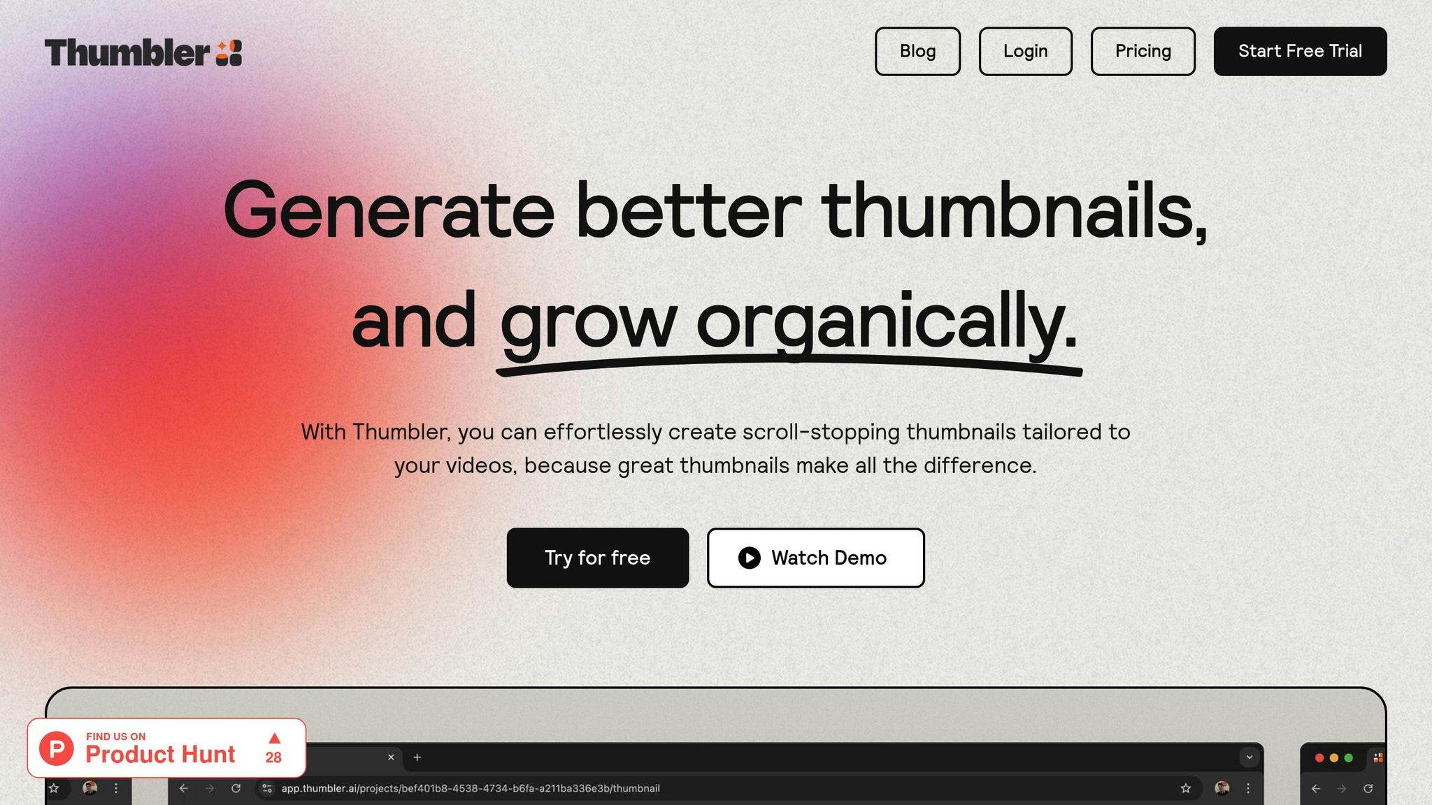
How Thumbler AI Simplifies Thumbnail Design

Thumbler AI takes the hassle out of designing thumbnails by providing smart, tailored suggestions based on your video themes. It analyzes your content and recommends layouts, colors, and visual elements that match your style. You can even build a branded library to ensure consistent design across all your videos. Once you establish your signature style, the AI generates variations that adapt your core design elements to fit different themes.
Another handy feature is its ability to compare multiple thumbnail options alongside various titles, helping you choose the most effective combination. The platform is designed to create engaging thumbnails by incorporating proven design principles and keeping up with current trends. In fact, research indicates that AI-generated thumbnails can boost click-through rates by up to 30% compared to simpler designs.
Improving Thumbnails with Testing Tools
AI doesn’t just help with creating designs - it also refines them. Tools like Thumbler AI allow you to test different thumbnail strategies side by side. For instance, you might discover that bright, minimalist designs work best for tutorials, while bold, colorful layouts perform better for entertainment videos.
The platform’s analytics capabilities give you insights into what works for your audience. You can track how elements like color schemes, text placement, and visual styles impact engagement. This lets you fine-tune your thumbnails so they align perfectly with your content’s theme. Start with AI-generated designs and then tweak them manually to add your personal touch.
Better Workflow for Multi-Channel Creators
For creators managing multiple channels, AI tools can be a game-changer. Thumbler AI helps you create separate branded libraries for each channel, enabling unique visual styles that reflect each channel’s vibe. Whether you’re designing polished thumbnails for an educational channel or bold, dynamic ones for gaming content, the platform offers tailored suggestions to match the tone of each channel. This saves you from starting from scratch every time and streamlines your workflow.
The platform’s pricing is also flexible, making it accessible for creators at different levels. Plans start at $12 per month for basic needs, with options for custom pricing if you’re managing studio-level operations across multiple channels.
Testing and Improving Your Thumbnails
Once you've nailed down a solid thumbnail design, the next step is testing and refining it. Why? Because even the best-looking thumbnail might not resonate with your audience the way you expect. By using testing and analytics, you can figure out what works and keep improving viewer engagement. The goal is to maximize click-through rates and keep your audience hooked.
A/B Testing Different Thumbnail Designs
A/B testing is a powerful way to see which thumbnail designs click with your viewers. It’s pretty straightforward: create two or more thumbnail variations, test them, and see which one performs better. Custom thumbnails play a huge role in how well your videos do, so it’s worth the effort.
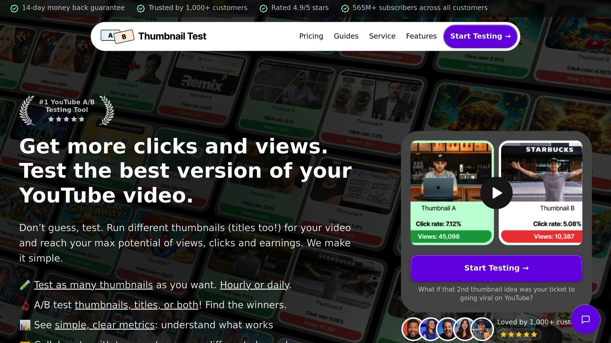
YouTube’s Test & Compare feature, introduced to over 50,000 creators in April 2024, goes beyond just measuring click-through rates. It evaluates performance based on watch time share, giving you a fuller picture of how your thumbnails are doing. However, you can only test three thumbnails per video, so choose wisely.
If you don’t have access to this feature, third-party tools like TubeBuddy’s Thumbnail Analyzer can help. You can also run manual tests using YouTube Analytics. For manual testing, create a few distinct thumbnail options, rotate them over a set period, and compare metrics like click-through rates and watch time.
When designing thumbnails for testing, aim for variety. Don’t just make minor tweaks like changing a font color - try completely different styles. For example, one thumbnail could feature bold, vibrant graphics, while another might focus on a minimalist approach with lots of white space. This way, you can identify which style aligns best with your content.
Using Analytics to Improve Your Strategy
Your analytics data is a goldmine for understanding thumbnail performance. Metrics like click-through rate, watch time, and audience retention can tell you which design elements are engaging your viewers. YouTube Analytics offers detailed insights into how people find and interact with your videos.
Pay attention to trends in your most successful thumbnails. For instance, your gaming content might thrive with bright, high-contrast visuals, while your tutorials could benefit from clean, straightforward designs. Use your A/B test results to spot recurring elements in your best-performing thumbnails, such as specific colors, text placement, or focal images.
Also, consider how your thumbnails appear on different devices. A design that grabs attention on a desktop might not have the same impact on a mobile screen. Make sure your thumbnails are effective across both platforms, and use your test results to fine-tune your designs accordingly.
Keep an eye on how your thumbnails perform over time. Audience preferences can shift, and a design that worked six months ago might not hit the same way now. Regularly monitoring your analytics helps you adapt to these changes and keep your thumbnails relevant.
Keeping Up with Design Trends
As you refine your thumbnails through testing and analytics, staying aware of design trends can give your content an edge. Trends in design evolve constantly, and incorporating them thoughtfully can make your thumbnails feel fresh and engaging. However, it’s important to balance trendy elements with a consistent brand identity. Updating your thumbnails is a simple yet effective way to breathe new life into your content and attract new viewers.
Some current design trends include bold minimalism with strong typography, AI-assisted designs for creative inspiration, and metallic accents like silver and chrome. Other popular styles feature pixelation for a retro-tech vibe, textured grains for depth, and maximalist illustrations with intricate, colorful details.
Newer trends are also emerging. Hypercolor uses intense, saturated hues with sharp contrasts, while chicken scratch embraces a rough, hand-drawn aesthetic. Minimal maximalism combines clean, luxurious elements with bold, extravagant touches, creating designs that are both sleek and eye-catching.
When using trends, make sure they enhance your thumbnail rather than just following the crowd. The trend should serve a purpose, whether it’s drawing attention or complementing your content’s tone. Feel free to mix trending styles with unexpected elements, but always stay true to your brand. Most importantly, add your own twist to make the design uniquely yours.
To keep things consistent, start by creating a couple of core templates for your different content types. Then, experiment with trending elements within those frameworks. A simple style guide and a library of branded assets can help you stay adaptable as trends shift. This way, you can keep your thumbnails fresh while maintaining the look your audience knows and trusts.
Key Points for Better Thumbnail Design
Designing thumbnails that truly resonate with your audience starts with understanding key performance metrics and sticking to a consistent approach. Custom thumbnails can significantly impact your content's visibility, driving better results across various formats.
One of the most important metrics to track is your click-through rate (CTR). A well-designed thumbnail can boost CTR by 10-20%. For reference, average CTR benchmarks are around 4-5%, with 6-10% considered strong, and anything above 10% being exceptional. Beyond CTR, keep an eye on metrics like average view duration, likes, and comments to gauge whether your thumbnails are attracting the right audience. These numbers highlight why systematic testing is critical.
Testing for Better Thumbnails
A/B testing is a powerful way to refine your thumbnail strategy. YouTube's Test & Compare feature, for example, allows you to upload three thumbnail variations and measure their performance with real viewers. In one test, the top-performing thumbnail captured 38% of clicks, while the second-best managed 31%. Brad Smith from Automation Links emphasizes:
"As you're building out your YouTube channel, you're going to see that what you care about isn't really what your customers care about."
AI tools are also revolutionizing thumbnail design. Platforms like Thumbler AI can increase CTR by as much as 30%. For instance, Marques Brownlee's YouTube channel saw a 25% CTR boost using AI-generated thumbnails, while Unbox Therapy achieved a 30% increase through AI-enhanced A/B testing. These tools simplify the design process and help predict which thumbnails will perform best.
Consistency and Creativity
While performance metrics are vital, maintaining a consistent visual style is equally important. Thumbnails should align with your brand while allowing room for creative expression. To achieve this, focus on high-contrast colors that stand out, clear focal points, and text overlays that complement the visuals. Using adaptable templates can help keep your design cohesive across different types of content while still matching each video's unique theme.
Continuous Improvement
Thumbnail design isn't a one-and-done task. Audience preferences and platform algorithms evolve, so regular optimization is essential. Keep an eye on analytics, stay updated with design trends, and experiment with new ideas. The best creators treat thumbnail design as both an art and a science, blending creativity with data-driven strategies to maximize their content's reach and impact.
FAQs
How do I choose the right thumbnail style to match my video content and branding?
To pick the perfect thumbnail style, make sure your design matches the theme and tone of your video while staying true to your brand's identity. Focus on using high-quality visuals that stand out - think expressive faces, bold colors, or eye-catching imagery. Incorporate clear, bold text and stick to your brand's fonts and color scheme to maintain a consistent look.
Keep your audience and video purpose in mind. For instance, emotional content might shine with close-up shots of faces, while educational videos could benefit from clean, straightforward designs. Try different approaches, like curiosity-driven or minimalist styles, to see what connects with your viewers. Pay attention to what performs well and tweak your strategy based on viewer engagement for the best results.
How can I use color theory to make my video thumbnails more emotionally engaging?
Using color theory wisely can make your video thumbnails more emotionally engaging for viewers. The colors you pick should match the tone and message of your content. For example, red often conveys urgency or energy, while blue gives off a calming and reliable vibe.
By tapping into the psychology of colors, you can create thumbnails that truly connect with your audience. This can boost click-through rates and improve overall engagement. Try using contrasting colors to highlight key elements, but ensure the design stays consistent with your brand’s look and feel.
How can Thumbler AI help me create better thumbnails for my videos?
Thumbler AI takes the hassle out of designing eye-catching, visually striking thumbnails by leveraging powerful AI technology. It ensures your thumbnails not only align with your video's theme and tone but also stay consistent with your brand's identity.
With Thumbler AI, you can produce professional-grade designs in no time - thumbnails that grab attention, increase click-through rates, and elevate viewer engagement. Plus, it offers data-backed insights to fine-tune your thumbnails for peak performance, making it a fantastic resource for content creators aiming to elevate their video appeal.