The secret to getting more clicks on YouTube in 2025? Your thumbnail colors.
Here’s why it matters:
- 70% of YouTube views are on mobile, so thumbnails need to pop on smaller screens.
- Viewers decide to click in just 0.3 seconds, and 90% of snap decisions are influenced by color.
- High-contrast, vibrant colors like yellow/black or red/white dominate attention.
Top-performing combinations include:
- Yellow and Black: Great for gaming or entertainment.
- Red and White: Perfect for action-packed content.
- Blue and Orange: Ideal for tech and educational videos.
- Light Purple with Contrasting Colors: A standout for lifestyle and creative niches.
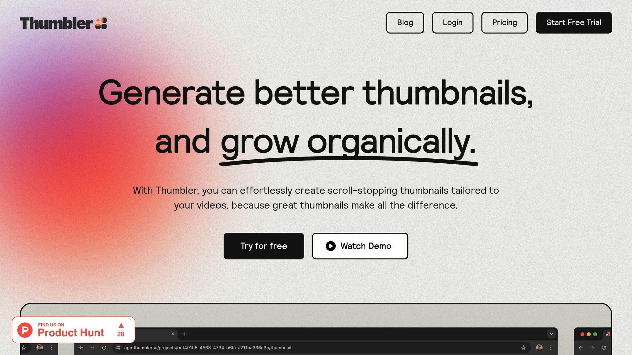
Creators are also leaning into clean, simple designs with limited palettes to cut through cluttered feeds. Testing tools like Thumbler AI help refine color choices, boosting click-through rates by up to 30%.
In short, picking the right colors can make or break your channel’s success.
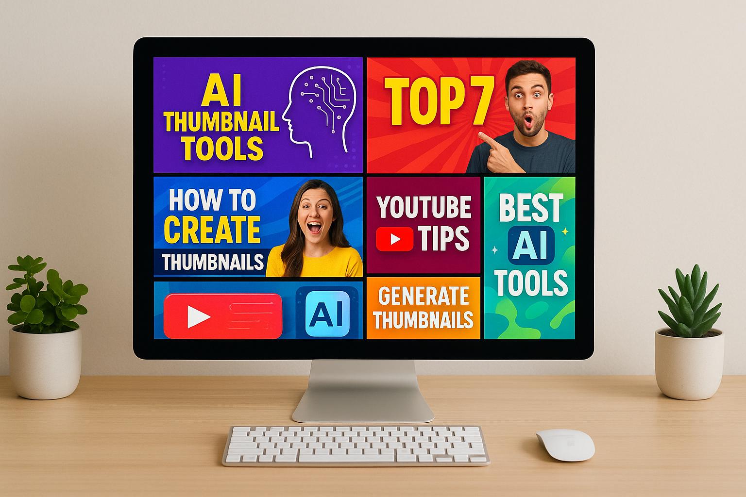
Best Colors for Thumbnails - 2025
How Color Works in YouTube Thumbnails
Grasping the role of color in YouTube thumbnails can make a big difference in attracting viewers. Studies indicate that thumbnails designed with thoughtful color choices can boost clicks by an impressive 312% compared to those that lack this strategy.
How Color Influences Viewer Decisions
Colors aren’t just visual elements - they spark psychological reactions that can determine whether someone clicks on your video. Warm tones like red, orange, and yellow are known for creating a sense of urgency and excitement. For instance, red often appears in gaming or action-focused thumbnails, where high energy is the theme.
On the other hand, cool tones like blue, green, and purple evoke feelings of calm and trust. Blue, often linked to reliability, works well for tech and educational content. Green suggests clarity and serenity, making it ideal for tutorials or how-to videos. Yellow grabs attention with curiosity but lacks the intensity of red, while purple adds a touch of creativity and sophistication.
By aligning your thumbnail's color palette with the emotion or tone of your video, you can set viewer expectations and create a stronger connection with your audience. These effects become even more powerful when combined with smart use of contrast.
Why High Contrast Colors Catch the Eye
Pairing emotional color triggers with high contrast can make your thumbnails impossible to ignore. High contrast ensures your thumbnail stands out in a sea of competing videos. Using complementary colors - those opposite each other on the color wheel - can heighten this effect. Think of combinations like red and green, blue and orange, or yellow and purple. These pairings create visual tension, making your thumbnail pop and grab attention.
Strengthening Brand Identity Through Color
Colors do more than attract clicks - they also help build your brand. A consistent color scheme turns your thumbnails into recognizable brand markers. Over time, viewers will associate your primary colors with your channel, fostering loyalty and familiarity.
Experimenting with different color palettes can reveal what resonates most with your audience. Whether bold and vibrant or soft and subtle, the goal is to find a scheme that fits your niche and stick with it. Consistency is what transforms individual thumbnails into a cohesive, memorable brand presence.
Best YouTube Thumbnail Color Trends for 2025
YouTube thumbnail design has come a long way, and creators are now using smart, data-backed color strategies to boost engagement and attract more clicks.
Top Color Combinations That Grab Attention
Yellow and Black
This pairing continues to shine as one of the most effective for thumbnails. Yellow grabs attention with its cheerful and alert vibe, while black provides sharp contrast, making text and images stand out in crowded feeds.
Red and White
Red and white remain a go-to combination, especially for gaming and entertainment content. Red conveys energy and urgency, while white offers a clean, simple background that catches the eye.
Blue and Orange
The balance of blue and orange works wonders in educational and tech content. Blue builds trust and reliability, while orange adds a burst of energy, drawing the viewer’s eye.
Light Purple with Contrasting Colors
Light purple is making waves in 2025. Its rarity helps it stand out, and when paired with contrasting hues, it becomes a great choice for creative and lifestyle content.
Using high-contrast elements with these combinations ensures both text and images pop, increasing engagement rates.
Simple Designs with Limited Color Palettes
Minimalist thumbnails are on the rise, driven by the need for quick viewer decisions. With so much content consumed on mobile devices, clean and simple designs are more important than ever.
Creators are focusing on uncluttered layouts with a single focal point and limited color palettes. This approach helps guide the viewer’s eye directly to the most important part of the thumbnail. As The Loomly Team puts it:
"Most importantly, you need a thumbnail they can actually compute that quickly."
Instead of complex visuals, many creators are opting for bold contrasts - like white text on dark backgrounds - and generous white space to ensure their message is instantly clear. Educational content creators, in particular, are finding success by sticking to 2-3 core templates for their thumbnails rather than constantly reinventing their designs.
Comparing Color Combinations for Performance
The effectiveness of a thumbnail isn’t just about looking good - it’s about how well it performs. Different colors resonate differently depending on the audience and content type. Here’s a breakdown of how some popular combinations stack up:
| Color Combination | Attention Level | Text Readability | Best Content Types | Brand Building Potential |
|---|---|---|---|---|
| Yellow/Black | Very High | Excellent | Gaming, Entertainment, Alerts | Strong |
| Red/White | Very High | Excellent | Gaming, Sports, News | Strong |
| Blue/Orange | High | Good | Tech, Education, Business | Very Strong |
| Purple/Light Colors | High | Good | Creative, Lifestyle, Beauty | Moderate |
| Minimalist (2-3 colors) | Moderate | Excellent | Education, Professional | Very Strong |
Well-crafted thumbnails can increase click-through rates (CTR) by up to 30%. In fact, using bold foreground elements on softer backgrounds can boost CTR by 20-50%.
While bold colors and high saturation often work well, some creators are shifting toward softer contrasts and authentic storytelling to connect with their audience. Gaming thumbnails might lean on neon greens and electric blues, while beauty and fashion creators often prefer pinks and purples.
It’s also important to consider how different audiences perceive colors. Testing various approaches with your specific viewers is key to finding the perfect strategy for your channel.
sbb-itb-de62d42
How to Test and Improve Thumbnail Colors
Testing thumbnail colors is a smart way to boost your video's performance. The best creators rely on systematic approaches to measure how well their thumbnails work, using data to fine-tune their choices.
Methods for Testing Color Performance
A/B testing is a must. YouTube's Test & Compare feature, for example, lets you test up to three different thumbnail versions at the same time.
When testing, pay attention to metrics like CTR (Click-Through Rate), AVD (Average View Duration), impressions, and engagement. For reference:
- A CTR of 4-5% is average.
- 6-10% is excellent.
- Anything above 10% is considered viral.
Additionally, aim for viewers to watch at least 50% of your video.
Tools like VidIQ and TubeBuddy can automate the testing process. If you prefer a manual method, periodically update your thumbnails and track the results in a spreadsheet.
Another helpful tip: study the top-performing videos in your niche. Look for patterns in their color choices to see what works.
Once you've got the basics down, you can explore more advanced tools to refine your testing.
Using Thumbler AI for Color Optimization

Thumbler AI takes thumbnail testing to the next level. Its comparison feature lets you evaluate different color combinations side by side, helping you make smarter decisions before hitting publish.
The platform uses AI to generate multiple thumbnail variations with a variety of color schemes, giving you more options to test. In fact, AI-driven A/B testing has been linked to a 25% increase in click-through rates compared to more traditional methods.
Thumbler AI also includes a branded design library. This feature allows you to create templates with your preferred color schemes while testing variations. Once uploaded, the platform's analytics tools track how each version performs over time, helping you figure out which colors connect best with your audience and content.
Making Decisions Based on Data
Let your audience's response - not your personal preferences - guide your choices. As Brad Smith, Owner of Automation Links, wisely says:
"What you care about isn't what your customers care about."
When reviewing your metrics, look for patterns. For instance:
- If impressions are high but CTR is low, it might be time to try a thumbnail with different colors.
- If CTR is high but AVD is low, your colors could be setting the wrong expectations for the content.
Keep detailed records of your tests. Note the colors you used, the type of content, your target audience, the time of posting, and any seasonal factors that might influence results. Don’t just test color combinations - try out different styles too. Experiment with minimalistic designs, bold contrasts, or even meme-inspired thumbnails to see what resonates.
A well-designed thumbnail can increase your CTR by 3-6%, which can make a big difference in your video's overall reach. Once you identify color combinations that consistently perform well, document your findings and apply them to future thumbnails. But don’t stop there - keep testing and refining.
Practical Tips for Picking Thumbnail Colors
Choosing the right colors for your thumbnails doesn’t have to be complicated. With some simple guidelines and a bit of planning, you can make your thumbnails pop and attract more viewers.
Basic Rules for Color Selection
Start by using colors that stand out against YouTube's white background. Shades like red, orange, and yellow are known for grabbing attention, while blue communicates calmness and professionalism. Green often represents growth or nature, and lighter purples can add a sense of creativity or luxury.
Make sure your text is easy to read. Follow WCAG contrast ratio standards to avoid issues like light text on light backgrounds or dark text on dark backgrounds. Since thumbnails are often viewed on small screens, clarity is key.
To create a balanced and eye-catching design, use a color wheel. Complementary colors (those opposite each other on the wheel) provide strong contrast, while analogous colors (those next to each other) offer a smoother, more cohesive look. Once you settle on a palette, document your hex codes and guidelines to maintain consistency across your thumbnails. This not only makes your content recognizable but also strengthens your brand identity.
Matching Colors to Your Content Type
Your color choices should reflect your brand and the type of content you create. Different genres naturally align with specific colors, so understanding your audience and goals is essential.
Start with your brand values. Ask yourself: Does your brand aim to appear bold, approachable, innovative, or traditional? For instance, blue works well for tech and finance channels because it conveys professionalism and calmness. On the other hand, red suggests urgency and excitement, making it a great fit for food or retail content.
Understand your audience. Conduct research to learn about your viewers’ preferences, including their demographics and cultural context. Color perception can vary widely depending on cultural background, so keep this in mind when targeting specific regions or groups.
For example:
- Gaming channels thrive with bright, energetic colors like red and orange that evoke action and excitement.
- Educational content often benefits from blues and greens, which suggest trust and growth.
- Beauty and lifestyle channels can use purples and pinks to highlight creativity and elegance.
"Color isn't just an aesthetic choice; it's a strategic decision that taps into the emotions, memories, and associations people subconsciously attach to certain hues." - C&I Studios
Look at successful channels in your niche for inspiration. For example, Duolingo uses vibrant green to symbolize growth and positivity, aligning with its user-friendly, gamified learning approach. Similarly, Trello relies on blue to evoke trust and productivity, while using bright, contrasting colors to make its labels and cards stand out.
Test your palette. Before committing to a specific set of colors, gather feedback through focus groups or online surveys. This step can help you avoid assumptions and ensure your choices resonate with your audience.
Once you’ve nailed down your palette, consistently use these colors to reinforce your brand and build recognition.
Keep Testing and Updating Your Approach
Even after finding a color strategy that works, don’t stop there. Continuous refinement is crucial for staying relevant and optimizing engagement.
Test one thing at a time. If you’re experimenting with colors, keep all other elements of your thumbnail consistent. This way, you can clearly identify the impact of your color choices.
Listen to your audience. Comments and polls can provide direct feedback on what’s working - or not. Often, viewers will point out what catches their eye or suggest changes they’d like to see.
Stay current with trends. Viewer preferences evolve, so keep an eye on emerging styles. Emotion-driven designs, for instance, are becoming increasingly effective at boosting click-through rates. AI tools can now analyze your video content to pinpoint emotionally compelling moments - like joy or surprise - that can influence your thumbnail design.
Study top creators in your niche to see what’s working for them. Use their strategies as inspiration but adapt them to fit your brand’s unique style.
Platforms like Thumbler AI can be a game-changer. Its comparison feature lets you test different color combinations side by side before publishing. Once your thumbnails are live, analytics tools track their performance, helping you identify which colors resonate most with your audience.
Finally, keep detailed records of your tests. Note the colors you used, the type of content, your target audience, posting times, and any seasonal factors that might affect results. This data will be a valuable resource for making smarter decisions in the future.
Key Points About Thumbnail Colors in 2025
Choosing the right colors for your thumbnails can make or break your channel's success. Bright colors like red, orange, and yellow naturally draw attention, while high-contrast designs help thumbnails pop against YouTube's interface. This isn't just speculation - 75% of YouTube viewers say the thumbnail is the most important factor when deciding whether to watch a video. These insights highlight the growing importance of emotional design and the role of AI tools in perfecting thumbnails.
Colors do more than just grab attention - they evoke emotions that directly influence whether a viewer clicks. As the YouGenie Blog puts it:
"Colors don't just catch the eye; they convey emotion, set the tone, and impact viewer choices".
Building on this, AI tools have taken thumbnail design to the next level. Complementary color combinations, which create strong visual contrast, consistently improve click-through rates. A well-crafted thumbnail can boost a channel's click-through rate by as much as 30%. The trick is aligning your color choices with your brand and content, ensuring your thumbnails send the right message before viewers even press play.
By 2025, emotion-driven designs and AI-powered tools have become essential for creators. With 93% of YouTube creators agreeing that thumbnails are the top factor influencing video views, refining your approach is no longer optional. AI-generated thumbnails, for example, can increase click-through rates by up to 30% compared to those made manually. Channels using these tools have seen an average 15% boost in click-through rates . Advanced AI software even analyzes video content to pinpoint emotionally impactful moments - like joy, curiosity, or surprise - and integrates those into thumbnails.
Take Thumbler AI as an example. This tool simplifies the process by allowing creators to test various color combinations and analyze audience preferences. Its analytics reveal which colors resonate most with specific viewers, taking the guesswork out of thumbnail design and helping creators make smarter decisions.
In 2025, success on YouTube depends on smart, strategic use of color. By understanding color psychology, using high-contrast designs, and leveraging AI tools, creators can craft thumbnails that not only catch the eye but also drive meaningful engagement with their audience.
FAQs
What are the best color combinations for my YouTube thumbnails based on my channel's niche?
Choosing the right color combinations for your YouTube thumbnails can make a big difference in grabbing attention and connecting with your audience. The best approach? Start by picking 1-2 main colors that reflect your channel's vibe and message. For instance, vivid colors like red, orange, or yellow are perfect for energetic niches like gaming or entertainment. On the other hand, softer shades like blues or pastels pair well with calming or educational content.
Sticking to a consistent color palette across your thumbnails helps build brand recognition, making your videos easily identifiable at a glance. To fine-tune your choices, try experimenting with different combinations and keep an eye on your engagement metrics. Over time, testing and tweaking will reveal what works best to improve click-through rates and keep your audience coming back for more.
How can I test and improve the performance of my YouTube thumbnails?
To make your YouTube thumbnails stand out in 2025, focus on creating visuals that demand attention. Use high contrast, bold colors, and clear focal points to draw the eye. These design choices can significantly improve click-through rates (CTR) and overall engagement.
Experiment with A/B testing to see which thumbnail designs resonate most with your viewers. Dive into your YouTube analytics regularly to monitor key metrics like CTR and audience retention. You can also leverage AI-powered tools to analyze and refine your thumbnails based on how viewers interact with your content.
While it's important to maintain a consistent look that reflects your branding, don't shy away from trying new creative approaches. Striking the right balance between consistency and fresh ideas can keep your thumbnails appealing and effective.
How can AI tools like Thumbler AI help create better YouTube thumbnails?
AI tools like Thumbler AI simplify the process of designing YouTube thumbnails by automating much of the work. These tools use advanced algorithms to study trends and understand audience preferences, helping you create thumbnails that grab attention and encourage more clicks.
With features that let you test different color schemes, layouts, and styles in just seconds, creators can quickly identify what appeals most to their viewers. Plus, by using AI-driven insights, you can fine-tune your thumbnails to match your brand’s look while increasing engagement and visibility.