Color psychology can make or break your YouTube thumbnails. Why? Because viewers decide whether to click in just three seconds, and color is the first thing they notice. Here's what you need to know:
- Red grabs attention and creates urgency.
- Blue builds trust and calmness.
- Green relaxes and inspires creativity.
- Yellow boosts mood but can strain the eyes if overused.
- High-contrast designs (e.g., red & white, yellow & black) consistently outperform others in click-through rates by up to 40%.
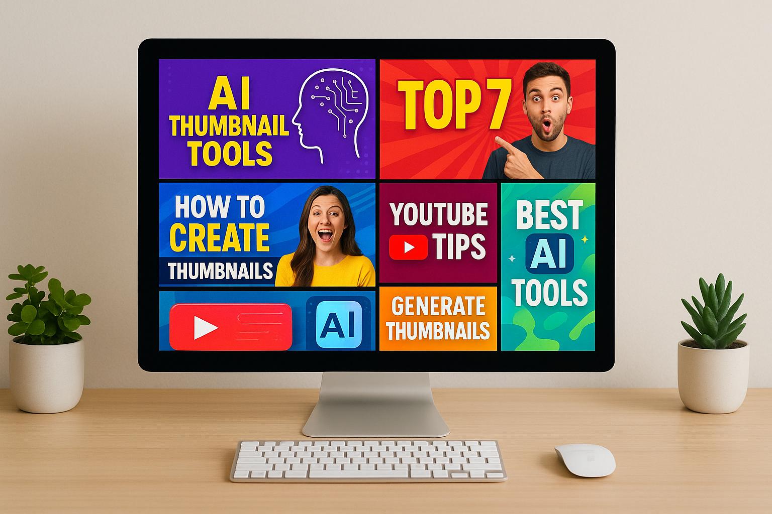
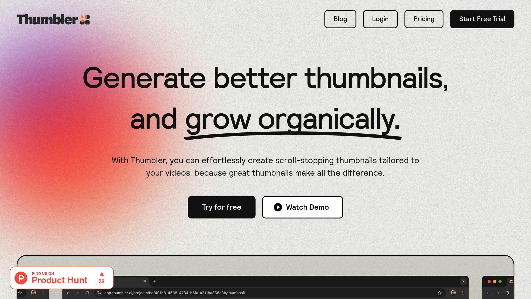
AI tools like Thumbler AI simplify the design process by analyzing color choices, testing variations, and offering data-backed recommendations. They help creators optimize thumbnails for better engagement and watch time.
For mobile users (now 70% of YouTube traffic), increasing contrast and using bold colors ensures visibility. Consistent branding with 2-3 dominant colors also improves recognition by 80%.
Want better results? Test, analyze, and refine your thumbnails using these insights.
Study Results on Color Impact
Colors and Their Mental Effects
Recent studies shed light on how specific colors evoke distinct psychological reactions in viewers. When people glance at thumbnails, their brains process visual information in just 13 milliseconds, with color being the first thing they notice. This instant recognition can determine whether someone clicks on a video or simply scrolls past it.
Red is the ultimate attention-grabber. It commands focus and encourages immediate action, often creating a sense of urgency or stimulating appetite. Blue, on the other hand, inspires trust and conveys a sense of stability and dependability.
Green symbolizes growth, nature, and prosperity while providing a calming effect. Eye-tracking studies indicate that green backgrounds make speakers appear more trustworthy and relaxing. Purple exudes richness and sparks creativity, making it a great choice for content focused on self-improvement or transformation. Meanwhile, Pink fosters a sense of care and connection, helping creators build a more personal bond with their audience.
The contrast between warm and cool tones also plays a key role. Warm colors like red, orange, and yellow evoke energy, excitement, and urgency. In contrast, cool tones such as blue, green, and purple promote calmness, trust, and relaxation.
How Colors Affect Click Rates and Watch Time
These psychological effects translate directly into user behavior, impacting both click rates and watch time. Research shows that red and orange buttons outperform others, generating 32-40% higher click rates. In fact, red call-to-action elements generate an average of $2.13 more per click compared to blue ones. This makes red particularly effective for creators aiming to boost their click-through rates.
High-contrast thumbnails can increase click-through rates by as much as 20%. Using complementary colors creates vibrant energy, while analogous colors offer a sense of harmony. For instance, SuperAGI tested two AI-generated thumbnail designs for a video about AI-powered sales tools. The version with a minimalist design and clear contrast achieved a 25% higher click-through rate compared to a bold, graphic-heavy version. Similarly, Automation Links optimized their thumbnails with AI and saw a 40% increase in click-through rates. These results are crucial, especially when viewers decide whether to watch a video in about three seconds. With 70% of YouTube traffic coming from mobile users by 2025, optimizing thumbnails for mobile is more important than ever.
Colors also influence watch time. Websites with well-thought-out color schemes hold visitors' attention 26% longer. Eye-tracking studies reveal that users spend 42% more time engaging with colorful designs compared to monochrome ones. This increased attention directly improves audience retention, which YouTube’s algorithm favors when recommending videos.
A skincare brand targeting Gen Z used pastel tones in their TikTok ads, aligning with the platform’s visual trends. This approach led to a 45% increase in sales within three months. This example highlights how tailoring color choices to platform-specific preferences can deliver tangible results beyond just clicks.
Color Effects Reference Table
Selecting the right color combinations can make or break a creator’s strategy. The table below summarizes key findings on how different color pairings perform:
| Color Combination | Impact Level | Text Clarity | Best Used For | Branding Strength |
|---|---|---|---|---|
| Yellow & Black | Very High | Excellent | Gaming, Alerts | Strong |
| Red & White | Very High | Excellent | Action, Sports | Strong |
| Blue & Orange | High | Good | Tech, Education | Very Strong |
| Light Purple + Contrast | High | Good | Beauty, Creative | Moderate |
| Minimalist (2-3 colors) | Moderate | Excellent | Education, Pro Content | Very Strong |
Black projects authority, making it ideal for premium content. White provides a clean backdrop, emphasizing other elements and improving focus. The combination of black text on white backgrounds results in 32% faster reading speeds, which is essential for thumbnails with text overlays.
Maintaining consistent color schemes can boost brand recognition by up to 80%. Sticking to 2-3 dominant colors across thumbnails strengthens brand identity. Additionally, applying the 60-30-10 rule for color distribution improves user retention rates by 28%, emphasizing the importance of balanced designs.
Mobile optimization adds another layer of complexity. Mobile users process visuals 52% faster than desktop users. Increasing contrast ratios by 35% above desktop standards enhances readability on mobile devices, especially in bright conditions. This is crucial given the dominance of mobile viewing on platforms like YouTube.
These insights underscore how thoughtful color choices can enhance engagement, improve retention, and reinforce brand identity.
Research Methods in Color Psychology
A/B Testing and Color Experiments
A/B testing serves as the backbone of research into thumbnail color effectiveness. This method involves showing different thumbnail versions to random viewers and analyzing their reactions to identify which design performs better. YouTube's Test & Compare feature has revolutionized this process. Initially introduced to a few hundred creators in mid-2023, the tool expanded to over 50,000 creators by April 2024. Unlike traditional approaches that focus on click-through rates, this tool prioritizes watch time share, offering a more detailed understanding of viewer engagement. This shift enables more precise studies on attention and behavior.
For instance, one campaign revealed that minimalist thumbnail designs could significantly increase click-through rates. By testing elements like color schemes, text placement, and visual hierarchy, creators can isolate how color influences viewer behavior. Analyzing successful thumbnails often uncovers patterns, such as specific color pairings or optimal contrast levels, that contribute to better performance.
Eye-Tracking and Attention Studies
While A/B testing measures overall performance, eye-tracking studies dive deeper, pinpointing exactly where viewers focus their attention. Research shows that people make decisions about thumbnails in as little as 50-100 milliseconds, making the initial color impact critical . Using tools to track fixation duration, saccade patterns, and heat maps, researchers can identify which elements grab and hold attention.
For example, studies indicate that 64% of viewers are more likely to click on a video featuring a thumbnail with a person. Eye-tracking data highlights how color choices around facial features can influence this preference. Additionally, high-contrast color combinations often create distinct eye movement patterns, leading to click-through rate increases of up to 20%.
AI Analysis for Color Selection
AI tools have taken color selection to a new level by making it a data-driven process. These systems analyze vast amounts of visual data, text, and metadata to predict how well thumbnails will perform. They assess factors like color schemes, visual hierarchy, object placement, and text readability. Heatmap analysis is often used to pinpoint areas that draw the most viewer attention. This data helps creators fine-tune thumbnails to improve metrics such as click-through rates, views, and engagement before publishing.
AI-powered A/B testing enhances traditional methods by allowing creators to test multiple thumbnail variations simultaneously. These systems can evaluate dozens of color combinations and design elements in just hours, making them invaluable in fast-paced content environments. For example, Thumbler AI not only tests color combinations but also evaluates visual hierarchy and text placement, offering actionable insights to improve thumbnails and boost video performance. This approach replaces guesswork with data-backed recommendations.
AI systems also analyze successful thumbnails across various content categories to identify recurring color patterns that drive engagement. Recent data shows that 70% of marketers now use AI-generated thumbnails to increase video visibility.
How to Apply Color Psychology
Picking the Right Colors for Your Content
Choosing the right colors can make a big difference in how your content connects with your audience. Colors like red and orange are perfect for high-energy content, such as gaming videos, sports highlights, or intense challenges. On the other hand, blue and green are ideal for instructional content, as they convey trust and professionalism. If your content leans toward creativity or inspiration, like art tutorials, motivational videos, or lifestyle vlogs, yellow and purple might be the way to go.
Think about the tone of your video when selecting colors. Warm tones like red, orange, and yellow convey energy and excitement, while cooler tones like blue, green, and purple give off a sense of calm and reliability. Another smart move? Take a look at what your competitors are doing. If most gaming channels are using red thumbnails, experimenting with blue or green could help your content stand out.
Once you've nailed down your color choices, focus on creating designs with strong contrast to grab attention instantly.
Using Contrast and Bright Colors for Impact
Contrast is your best friend when it comes to making your thumbnails pop. Pairing complementary colors naturally creates a visual impact that grabs attention better than a single color alone. Bright colors, when used sparingly as accents, can highlight important details without overwhelming the overall design. For example, imagine a thumbnail with a blue background - adding a bold yellow text overlay or border can create a striking focal point that draws the eye.
Keeping Brand Colors Consistent
While experimenting with colors, don’t lose sight of your brand identity. Incorporate your brand’s color palette thoughtfully to maintain a consistent look across your channel. For instance, if blue is a key part of your brand, you might use blue text overlays on all your thumbnails while varying the background colors to match the theme of each video. This balance keeps your branding clear but allows for creative flexibility.
To fine-tune your choices, consider using tools like Thumbler AI to A/B test different color combinations. By analyzing performance data, you can see which colors resonate most with your audience and refine your palette accordingly. Combining consistency with effective contrast ensures your thumbnails are both visually appealing and on-brand.
Summary and Future Research
Main Points from This Article
Color psychology plays a key role in the success of YouTube thumbnails. With viewers making decisions in about three seconds, vibrant colors and strong contrasts are crucial for grabbing attention.
Colors also have a strong emotional influence. Warm tones can evoke excitement or urgency, while cooler shades suggest calmness, trust, and professionalism. Using complementary colors helps text and visuals stand out, while consistent use of primary colors strengthens a channel's branding.
A/B testing is a must for creators aiming to fine-tune their thumbnails. Experimenting with various color schemes and analyzing the results provides valuable insights into audience preferences. Tools like Thumbler AI simplify this process by enabling creators to test and compare color combinations, helping them optimize their strategies based on actual performance data. These findings highlight the importance of regularly testing and adjusting thumbnail colors.
Areas for Future Research
While this article sheds light on effective thumbnail color strategies, there’s still much to explore. One promising area is how cultural differences shape color perception in digital content. For example, research shows color can enhance brand recognition by up to 80%, but most studies focus on Western audiences.
Consider the case of Pepsi, which faced backlash when it introduced light blue vending machines in Southeast Asia - a color tied to mourning in the region. Similarly, Euro Disney initially used purple in its marketing materials, only to learn that purple is associated with death in Catholic parts of Europe. These examples underscore the need for more research into how cultural contexts influence color preferences.
Another avenue is studying how individual factors like personal experiences, age, or health affect color perception. While humans can distinguish up to ten million colors, little is understood about how these factors shape preferences, particularly in the context of thumbnails.
AI's role in color analysis is also expanding. Future studies could combine A/B testing with AI tools to examine how different demographics perceive and respond to colors. Additionally, exploring how people learn and categorize colors could lead to more advanced tools for optimizing thumbnails. Finally, while much is known about the impact of individual colors, the psychological and emotional effects of specific color combinations deserve closer attention. These research directions could provide even deeper insights, helping creators make smarter, data-driven decisions for their thumbnails.
sbb-itb-de62d42
How To Make a Thumbnail 'POP'? - Color Theory In Thumbnails
FAQs
How can I use color psychology to make my YouTube thumbnails more clickable?
How to Use Color Psychology for Clickable YouTube Thumbnails
When designing YouTube thumbnails, color psychology can be a game-changer. The colors you choose can evoke specific emotions and influence how viewers perceive your content. For instance, red and yellow are vibrant and attention-grabbing, often sparking feelings of energy or excitement. On the other hand, blue tends to signal trust and calmness, making it a great choice for creating a sense of reliability.
Another trick? Contrasting colors. Pairing colors that stand out against each other ensures your thumbnails pop, even in a crowded feed. This can make a huge difference in catching a viewer's eye.
But there's more to it than just picking bright shades. To truly connect with your audience, consider their preferences and cultural associations - especially if you're targeting U.S. viewers. Colors carry different meanings across cultures, so tailoring your choices to align with your audience's expectations can make your thumbnails more effective.
If you're unsure where to start, there are plenty of tools available to help creators apply these principles. They can guide you in selecting the right colors to match your content's vibe and message, giving your thumbnails the best chance to stand out.
How does AI help improve thumbnail colors to boost viewer engagement?
AI takes thumbnail creation to the next level by studying viewer behavior, preferences, and trends to pinpoint the most eye-catching color schemes and layouts. It fine-tunes crucial elements like color contrast, visual hierarchy, and text clarity, making sure thumbnails are not only visually appealing but also attention-grabbing.
With AI, creators can craft thumbnails that resonate emotionally, match the tone of their content, and boost click-through rates. This technology simplifies the process of selecting impactful designs, helping save time while driving better engagement and visibility.
Why should cultural differences be considered when selecting colors for digital content?
The Impact of Cultural Differences on Color Perception
Colors carry a variety of meanings, and these interpretations can vary widely across cultures. Take the color red, for example. In some cultures, red is a symbol of good fortune and celebration, while in others, it’s linked to danger or serves as a warning.
Recognizing these cultural nuances is crucial when creating content for a global audience. Thoughtful color choices can help your message resonate positively and steer clear of unintended misinterpretations. When used wisely, colors can make your digital content more inclusive and better understood by diverse audiences.